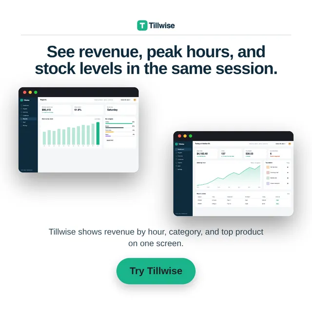
Why dashboard screenshots usually make bad ads
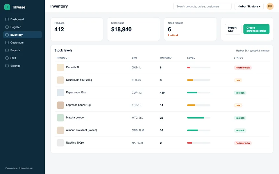
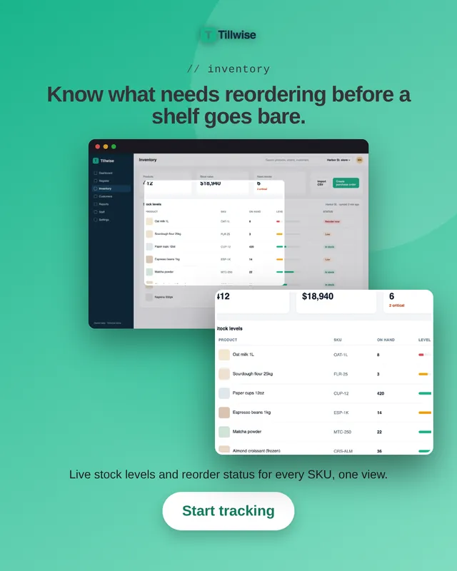
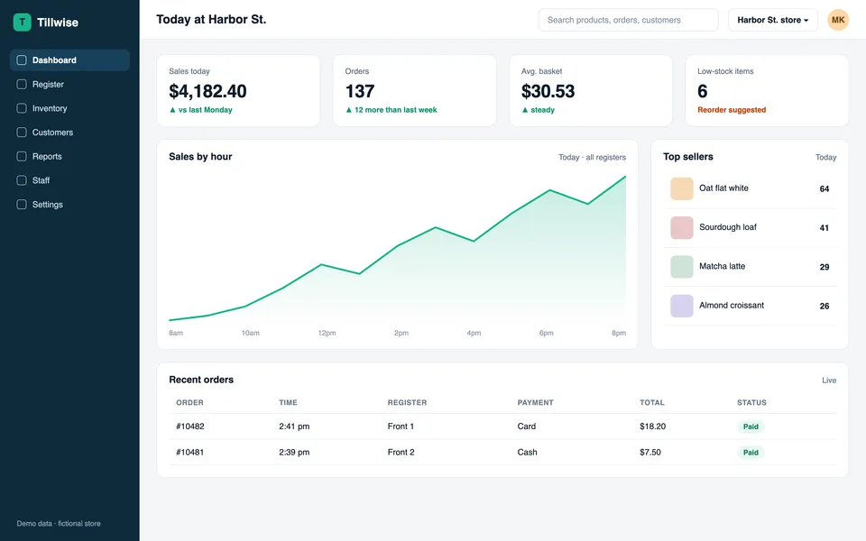
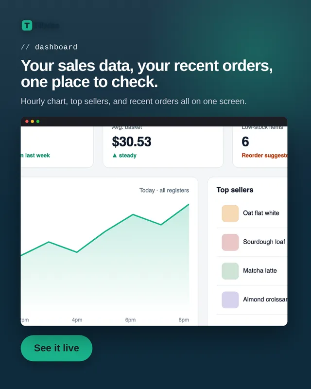
A 1440px dashboard shrunk into a 1080px square becomes unreadable grey lines, and that is where most SaaS ads die. The fix designers use is a crop: show the whole product for context, then enlarge the one panel that proves the claim.
Batchcraft does that crop for you. It reads what each screen contains and chooses the panel that matches the headline, so "know what needs reordering" sits next to a stock table you can actually read.
Copy that names the feature
Headlines are written per screen from what the screen shows and what your site says, not from a generic SaaS template. Numbers that appear in your demo data are not turned into claims, and invented stats such as "10x faster" are blocked.
You can steer the batch in plain language: "lead with reporting", "for agency owners", "mention the free trial".
Statics for the click, reels for reach
The same screens become a 15-second 9:16 reel with captions and an optional voiceover that walks through the feature. Run the reel for cheap reach on Reels, TikTok and Shorts and the statics for retargeting and LinkedIn or Reddit feeds.